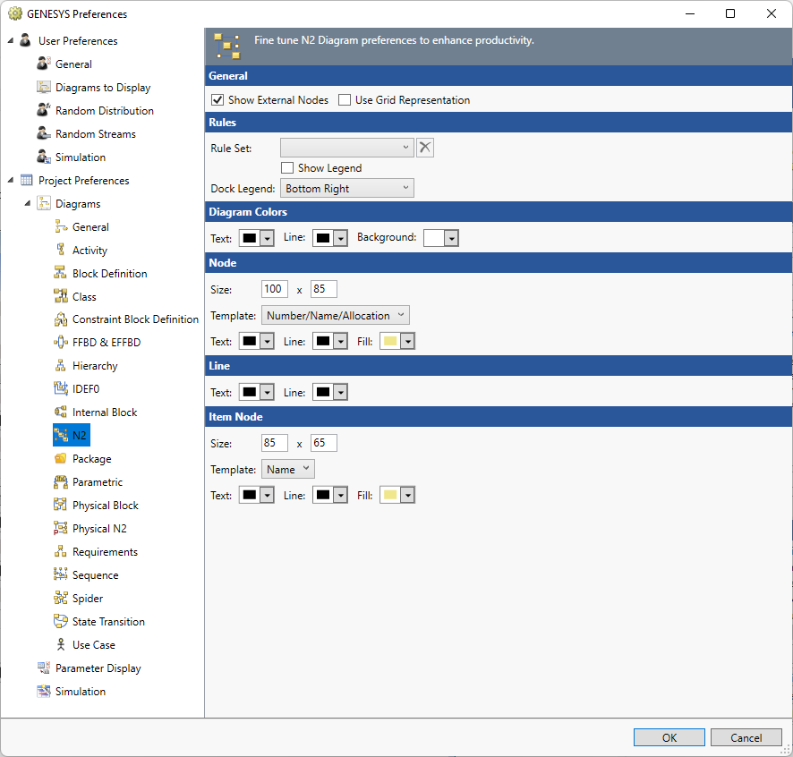
N2 Diagram Project Preferences

The N2 (pronounced "N-squared") diagram project preferences allow you to determine how N2 diagrams are displayed by default (options controlling what is displayed and how). Individual N2 diagrams can then be customized, as desired.
Options set in the Project Preferences dialog establish the defaults for all future diagrams. Any diagrams which are open or diagrams for which there is a stored view will not be affected by changes to the ProjectPreferences. To change individual diagram views, from the open diagram, with nothing selected from the Toolbox select the Properties tab. This will allow changes to the individual diagram and change only the local options.
General
Show External Nodes - controls whether or not to display interfaces which are joined to components on the diagram but do not have a second connected component on the diagram. Showing external interfaces helps identify unconnected interfaces or interfaces that cross component boundaries.
Use Grid Representation - controls whether a matrix layout should be used in place of the traditional node and connecting line representation.
Rule Set
The Rule Set that should be applied on opening a new diagram.
Show Legend - controls if a legend that explains the rule sets appears on the diagram.
Dock Legend - controls the location where the legend appears on the diagram: bottom left, bottom right, floating, top left, and top right.
Diagram Colors
The order of precedence GENESYS uses when deciding which color to use on a specific node on a diagram is as follows. If a color setting is nil/automatic, GENESYS will continue to move down the list until it identifies the color to be used:
-
Colors applied directly to the specific node on the specific diagram (set using the Toolbox Properties settings on the diagram)
-
Colors specified for the entity in the Rule Set selected.
-
Colors specified for the entity text, line, and fill attributes (set on the Properties tab of the entity property sheet)
-
Colors specified for the entity class text, line, and fill properties (set on the Class property sheet)
-
Node colors specified for the diagram type (set in Project Preferences)
Text - controls the color of the text on the diagram.
Line - controls the color of the lines on the diagram.
Background - controls the color of the background on the diagram.
Node
The node settings control the default display of the nodes on the diagram. On a given diagram, individual nodes can then be customized, as desired.
Size - controls the default width and height of nodes on the diagram. The width and height must each be between 10 and 500 pixels, inclusive.
Template - this drop-down allows you to select the desired node content from the collection of templates defined at the project level. You can display any combination of entity information and labels on the node. Node templates can be created or customized via the Node Templates under the Utilities section of Project Explorer.
Color - provides access to the standard color toolbox to set the default text, line, and fill color used when drawing nodes on this diagram.
Line
Text - controls the color of the text on the diagram.
Line - controls the color of the lines on the diagram.
Item Node
The item node settings control the default display of the off-diagonal input, output, and trigger nodes on the diagram. Individual items can then be customized, as desired. The options available are largely identical to the node options.
|
NOTE: |
Because each off-diagonal node connecting one function to another can represent multiple individual items, the item nodes on the N2 diagram use a special class of node templates referred to as multi-object node templates. These node templates can be created or customized via the Node Template under the Utilities section of Project Explorer. They have similar capabilities to standard, single-object icon templates but are customized to display multiple entities within one node. |
|
NOTE: |
Note that multi-object icon templates cannot use image representations (it would be ambiguous as to which entity image to use). Therefore, the use image toggle is not shown for item nodes. |